Product Strategy, UX, UI
Tipping screen optimisation
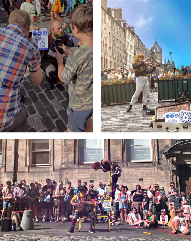
busk.co offers free tech tools for buskers to earn and develop sustainable artistic careers; it is the only successful online tipping platform designed for street performers worldwide.
This project focused on optimising the tipping screen to increase the number and amount of tips.
I led this year-long redesign project, following a data-driven approach to UX design. It consisted of six stages: 1. Developing Hypotheses, 2. A/B Testing Hypotheses, 3. Redesign proposals, 4. Testing redesign prototypes, 5. Design iterations & implementation, and 6. A large-scale research study at the Edfringe festival.
1. Developing Hypotheses.
Diving into the data
I started by doing a UI audit and analysing the existing metrics. I identified opportunities to decrease tip abandonment by improving the sense of trustworthiness, increasing the tip value by amplifying the patrons’ emotional experience, and the need to make the whole process frictionless and fast by enhancing the UI.
In three words: Exciting, reliable and easy.
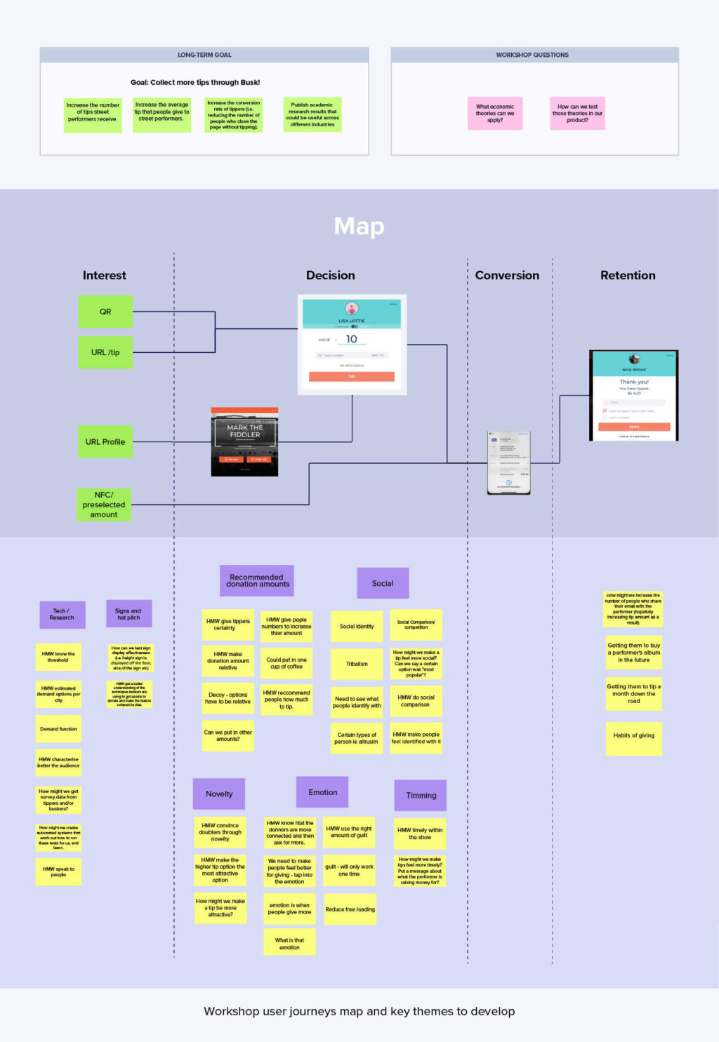
Workshop
As a next step, I led a workshop with my team and economists from the University of New South Wales to discuss behavioural economic concepts, such as Anchoring Bias and Decoy Effect, to translate them into the UX design.
At the end of this first phase, I developed eight hypotheses to test by tweaking the current design.
2. A/B Testing Hypothesis
I used Optimisely to modify certain elements of the existing User Interface on the 20 most popular selected profiles. The tests included variations in size, messaging, colour or location of the User Photo, the CTA, the default value, etc. After this test, I deduced which elements had a more significant impact on our objectives.
3. Redesign proposals
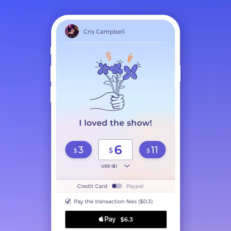
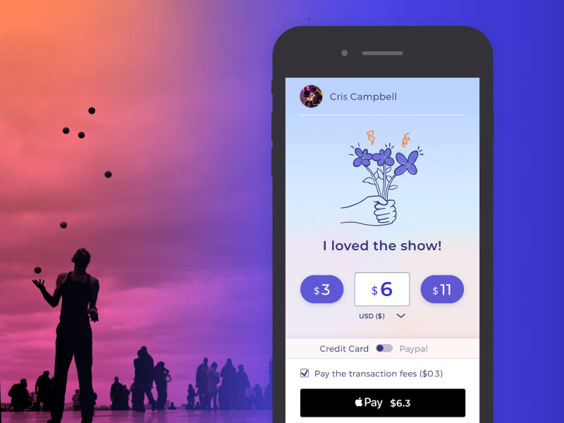
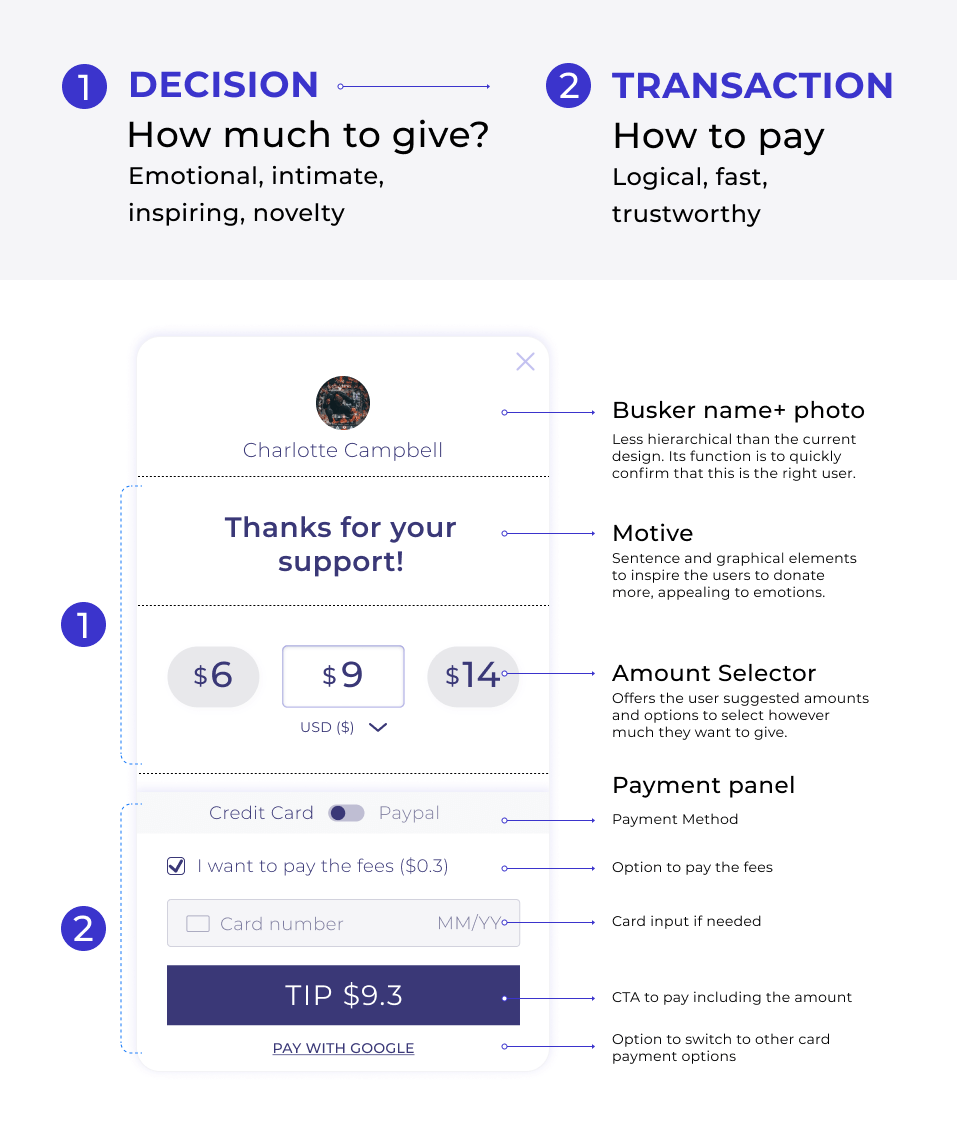
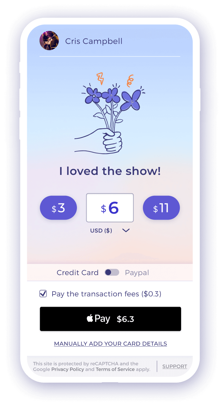
One of the first big design decisions was to divide the experience into two moments; first, the more emotion-charged instant of choosing the amount to tip and, secondly, the logic-charged step to complete the transaction.
We guide the user’s decision-making journey, making it more accessible to reach the conclusion we expect.
Tippers don’t have to decide how much to give and how to pay, all at the same time. Instead, they first focus on the emotional aspect of giving, reinforcing their already existing motivation to tip, and afterwards, they analyse the transaction options and complete the tip efficiently.
I designed four options to test. The main difference is the emotional part, which has more complexity and a larger impact.
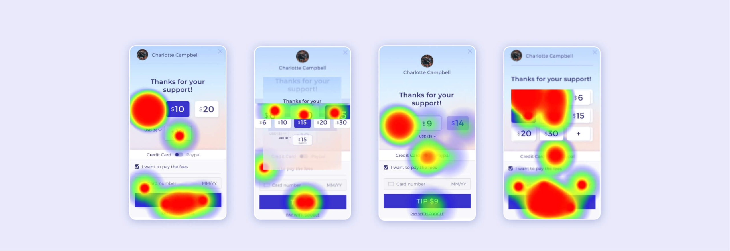
4. Testing redesign prototypes
I conducted a remote test in Maze, that included 300 users, giving them one randomly-selected option to experience. I measured the time it took to complete the tip, and the value of the tips, and collected qualitative feedback to understand their feeling right after tipping.
From that test, we concluded that the general structure works. Most users describe the experience as easy to understand and fast. I identified the main behavioural patterns on each option, analysing the relationship between the displayed amounts, the interaction options on the screen, the tipped amounts, the time it took and the feeling of generosity.
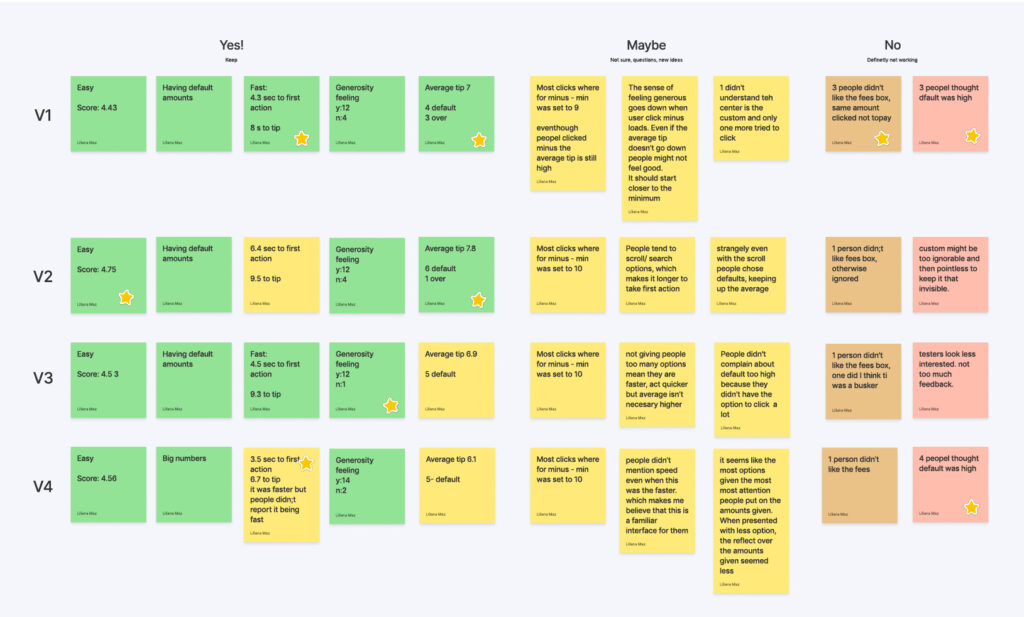
Test results’ analysis matrix
Impact
The number of tips processed on the site increased by 404%, the average tip value increased a 23%, and artists using the website saw a 40% increase in their income.
As such, the new design also attracted far more artists to actively use and promote the site, as word of mouth spread news about how effective our platform was for them. This translated to a tripling in the number of buskers being tipped on the platform.
Most importantly, we proved that digital tipping on the streets is viable and gave artists the confidence to use these methods to earn more.
6. Large-scale study
Once the design was proven to be working, we launched a large-scale study with the Economists From the UNSW.
The main objective of this study was to identify the best default value and the best ratio between the three presented options. Using A/B testing software, we ran a series of simultaneous, randomly- controlled trials to see how changing the values affects the average tip and conversion rate.
In this last part of the research, I participated as a consultant to identify the data to gather, the variables to test, software solutions, and some materials’ designs. Our team ran the study, and the economists and data analysis from the UNSW processed the results. The study hasn’t been published yet.
Learnings
Product optimisation can have a significant impact if done well.
A multidisciplinary approach is instrumental when it comes to product design. Sometimes designers need to speak directly to users to understand them. Other times, we need to apply complex concepts already-developed by specialised researchers; academic research and UX research must complement because we will never have enough time to study humans in such detail. I’ll endeavour to work together with academic researchers or experts from other disciplines more often in my practice.