Product Strategy, UX, MVP
Sustainable Fintech App
I led the end-to-end UX and product design for a green investment app to help people find ESG (Environmental, Social, and Governance) investment funds aligned with their sustainability values and their financial risk profile.
I owned the full process: design sprint, journey mapping, concept development, prototyping, user testing, UI design for the MVP, and implementation support.
The challenge
The client had developed a methodology to score how the funds align with the UN Sustainable Development Goals. They wanted to show this data in an engaging and trustworthy way, so users could truly understand what they were investing in and make decisions with confidence.
The main assumption from the client was that exposing the full depth of the data would build trust, so we just needed to find the right visuals. However, the underlying challenge was to make the experience accessible, by simplifying information, without losing depth and credibility.
Reframe: Information is not inherently valuable.
In early prototype testing, the most complex graphs, which from the founders’ point of view showed rich, valuable data, simply didn’t work with users. They appreciated the quality of the information, but didn’t find them useful. As one user put it: “this is nice, but it doesn’t have as much value for me.”
The problem wasn’t the quality of the information, but its context: a graph that would be insightful later in the journey becomes noise when introduced too early.
By exposing the gap between what the team knew to be important and what users were actually able to understand, I shifted the funders’ mentality towards understanding where users are in their journey and meeting their requirements at each point.
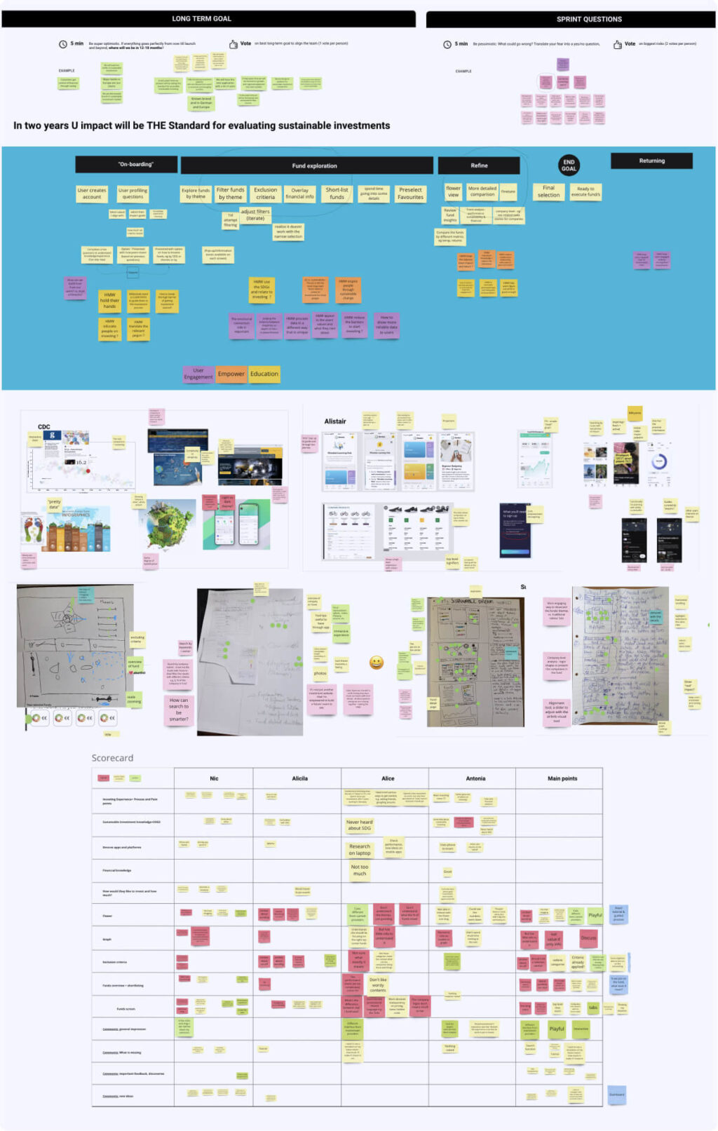
Prototypes
MVP
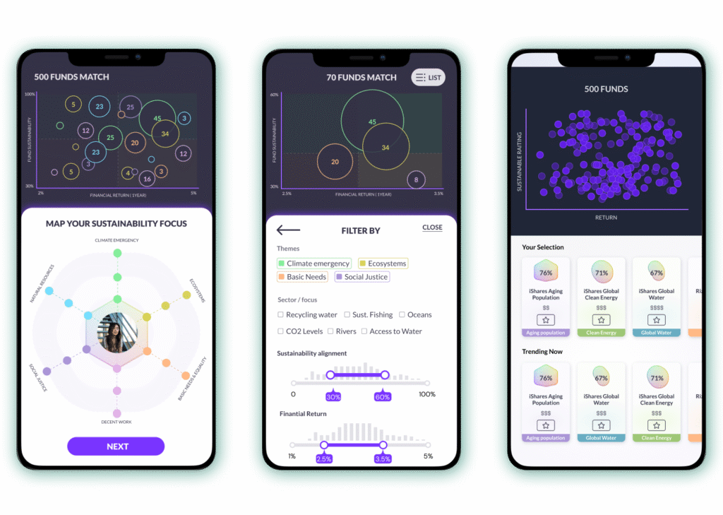
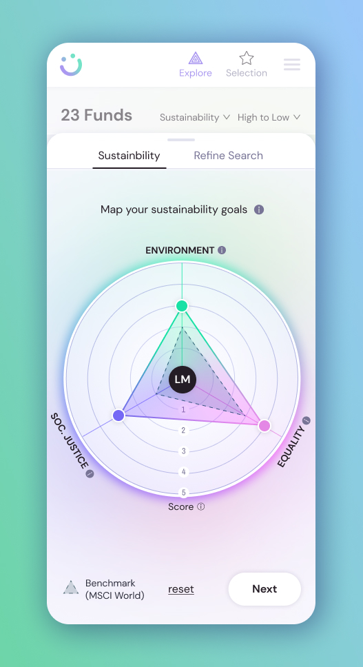
The Flower: starting with the user
The MVP is built around “the flower”, a personalised visual element generated from the users’ sustainability priorities. Each category has a distinct colour and by selecting their importance, the user creates their own the shape. This element serves two functions: firstly, it is an identity element created during onboarding, and secondly, it is the first layer of fund filtering.
Instead of dropping users into a list of funds, the experience starts with the user: asking them what matters to them, what they want to prioritise, and how they think about risk. As a result, this reduced the initial cognitive load and gave users a clear point of reference throughout the experience.
In testing, the colour coding across sustainability categories was immediately intuitive and became the foundational visual language; “the flower” boosted engagement from the start, landing better than expected. The playful tone was valued as unique from other financial platforms.
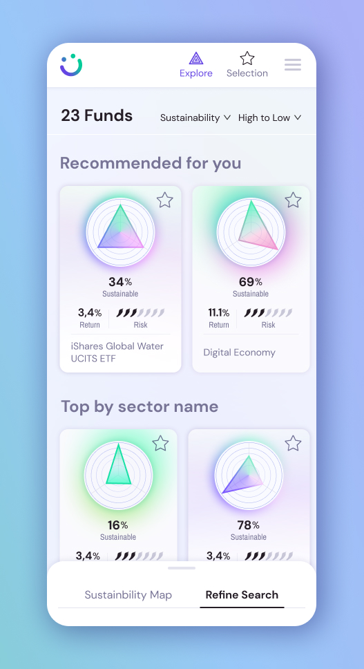
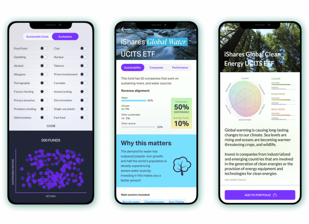
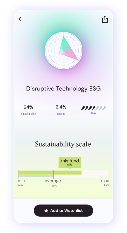
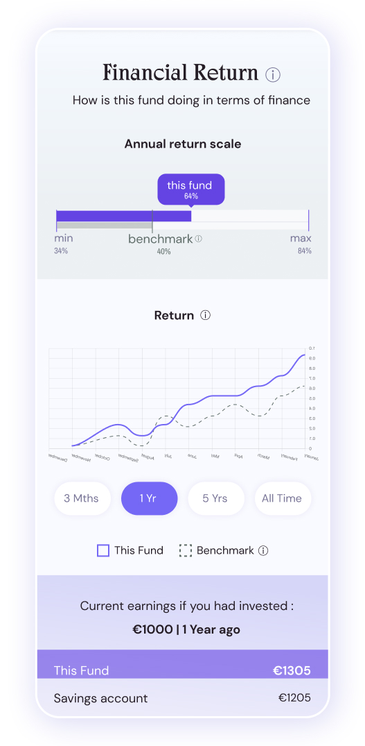
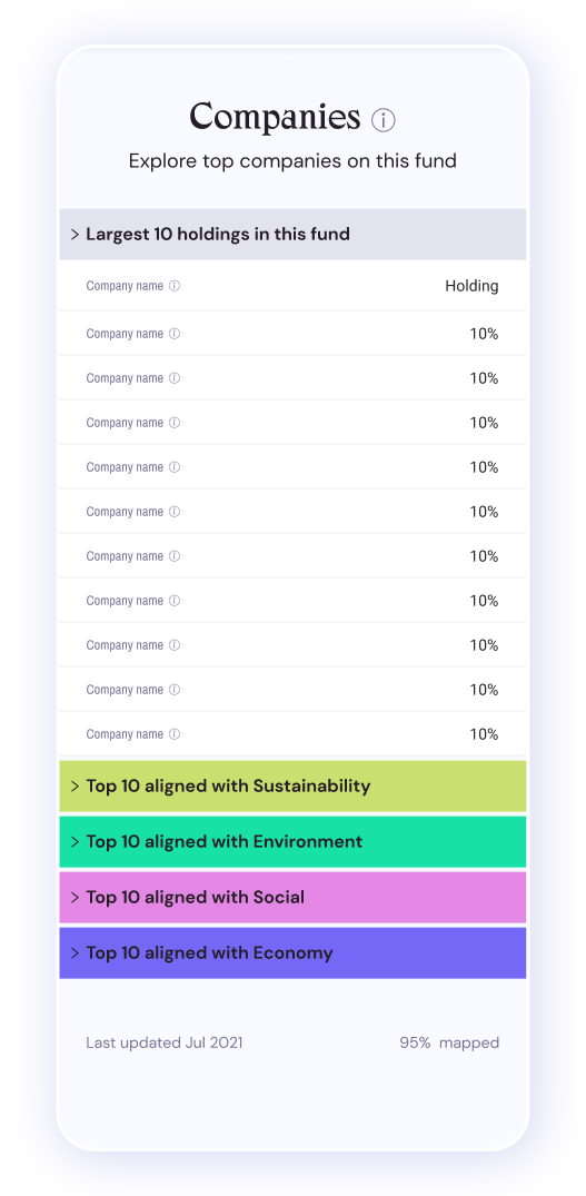
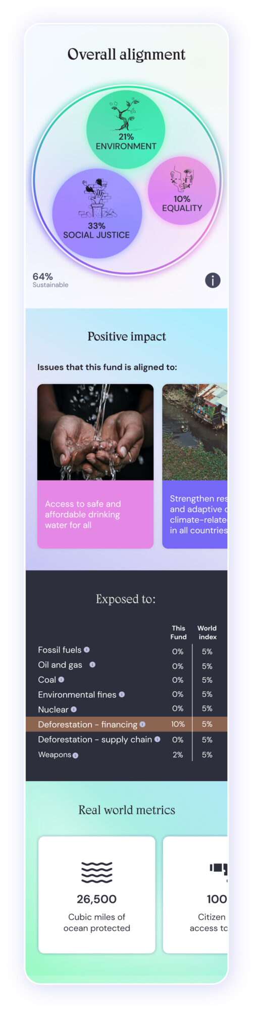
Exploring funds
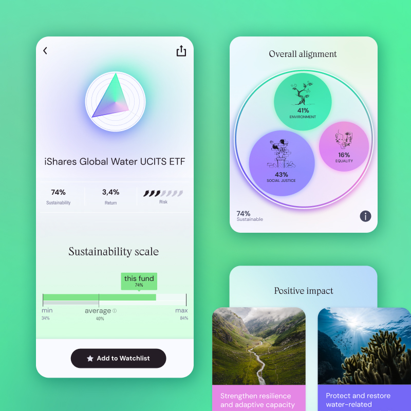
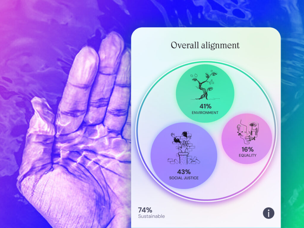
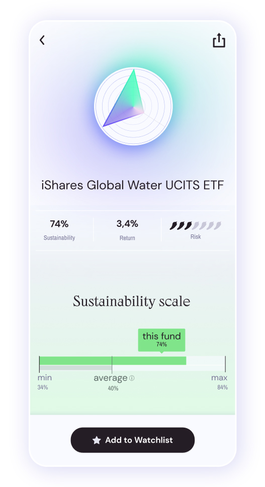
The fund list shows high-level indicators for quick comparison. As users move forward, they can access more detailed information; first summaries, then more complex breakdowns.
Graphs and detailed data are available at later stages, where users have already built some understanding and have started to form preferences. At that point, complexity becomes useful. It helps users validate and refine decisions.
Instead of forcing a single path, the interface allows users to follow the content that matters to them and interact with different types of information and at different levels of detail. Some users connected with the photography, others with graphs, others focused on performance data or company details. Some steady at a high level, others go progressively deeper.
This solution supports the way in which the brain also narrows options over time, building a running score for each choice,gathering evidence until confidence crosses a threshold. Early in the process, the threshold is loosely set, you’re getting an impression, not committing. As a real decision approaches, it demands more specific evidence.
Impact
The final product shifted from presenting information to a personalised journey to support decision making. By structuring the experience, to allow users to build context in layers, at the end they engaged more with more complex layers of information and were able to move from initial interest to more confident evaluation.
Beyond the product design, a key part of my role was helping the founders shift from an assumption-driven approach to an evidence-driven one. We took assumptions and tested them with users. As a result, instead of focusing on what the product could show, they began focusing on what users could meaningfully engage with at each step.